CALL (518) 523-3361
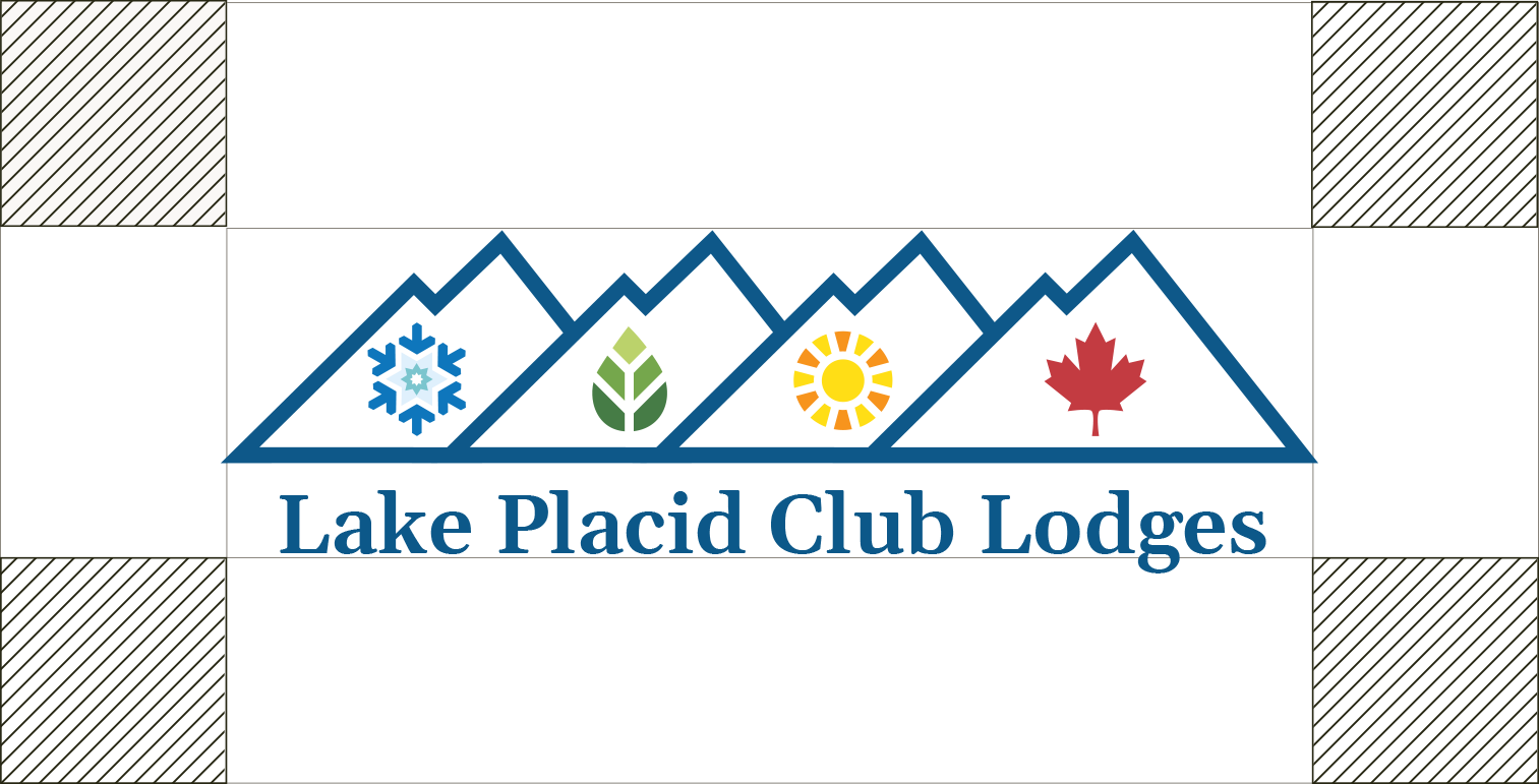
To ensure the logo maintains a high level of visibility it is important that it is surrounded by a minimum amount of clear space. No other graphic elements should encroach within this area. The exclusion zone is a ratio of the height of the logotype above, below and at both sides. It creates a boundary around the logo.
To preserve the readability of the logo it should never be sized bellow certain dimensions. The minimum length is 46 mm when used in print and a lenght of 130 px in digital environments.
Logo Incorrect Usage
The logo must always be reproduced in its original state and according to the guidelines. These examples illustrate modifications that must be avoided.
Do not alter the colour of the brand mark.

Do not use the logo with low contrast.
Do not stretch, rotate or skew the logo.
Do not use the logo as an outline.

Do not add any effects on the logo.
Do not combine with other graphic elements.
Secondary Logo
For use on Social Media, Merchandise and Other Options
For optimal use on social channels, merchandise, and other scenarios, several icon versions of the logo are provided, including seasonal variations. By using the logo brandmark, we make the most of the space for the logo and take away any issues relating to legibility. The clearspace is adjusted to secure maximize impact.
When the icon is small, forcing Lake Placid Club Lodges text to be illegible, do not include it with the icon. Instead, place “Lake Placid Club Lodges” elsewhere on the object. Do not use a font size smaller than 6pt, and if it is reversed on the background ask the printer what size it should be.
Also, do not go so small on the icon that the four seasons’ icons will not print well.


